

1. Dynamic Type: The principle of visual adaptation
2. AAA Contrast: Ensuring universal readability
3. VoiceOver: Deep contextualization
4. Other crucial accessibility modifiers
5. Accessibility Inspector
6. Conclusion
Accessibility in iOS apps is not optional; it is a fundamental requirement that ensures all users, regardless of their abilities, can interact with and understand the app’s content.
Dynamic Type: The principle of visual adaptation
Text size settings are the most common way users customize readability. As developers, we must respect users’ font size preferences. Ignoring these preferences can render the application unusable for those who rely on large text.
To ensure correct scaling, we as developers must take the following into consideration:
- Font metrics: In the UIKit environment, UIFontMetrics should be used for automatic text scaling. If we use SwiftUI in our project, this scaling is automatic…
- Responsive design: It is necessary to create an adaptable design that grows vertically. This ensures that, when the font size is increased, elements do not overlap or get cut off but rather provide the necessary space for the text and other elements.
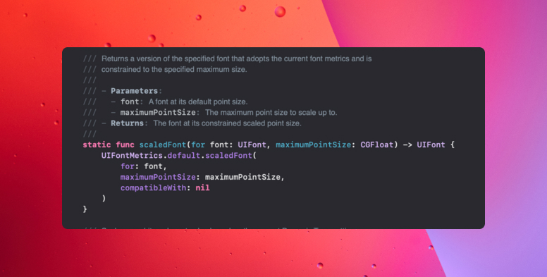
To make this task easier, Apple recommends using Text Styles (such as .title, .body, .caption), as these facilitate the system’s automatic response to changes in preferences and font size.
AAA Contrast: Ensuring universal readability
Color contrast is vital for making text distinguishable for users with low vision or color blindness. The goal is to achieve a minimum color contrast ratio of AAA.
- Priority application: This high contrast standard is essentially important in titles, main text, and buttons. In these elements, direct readability affects navigation and content comprehension.
- Verification tool: Developers and designers should use specific tools, such as the Color Contrast Analyzer, to verify that contrast ratios are met.
VoiceOver: Deep contextualization
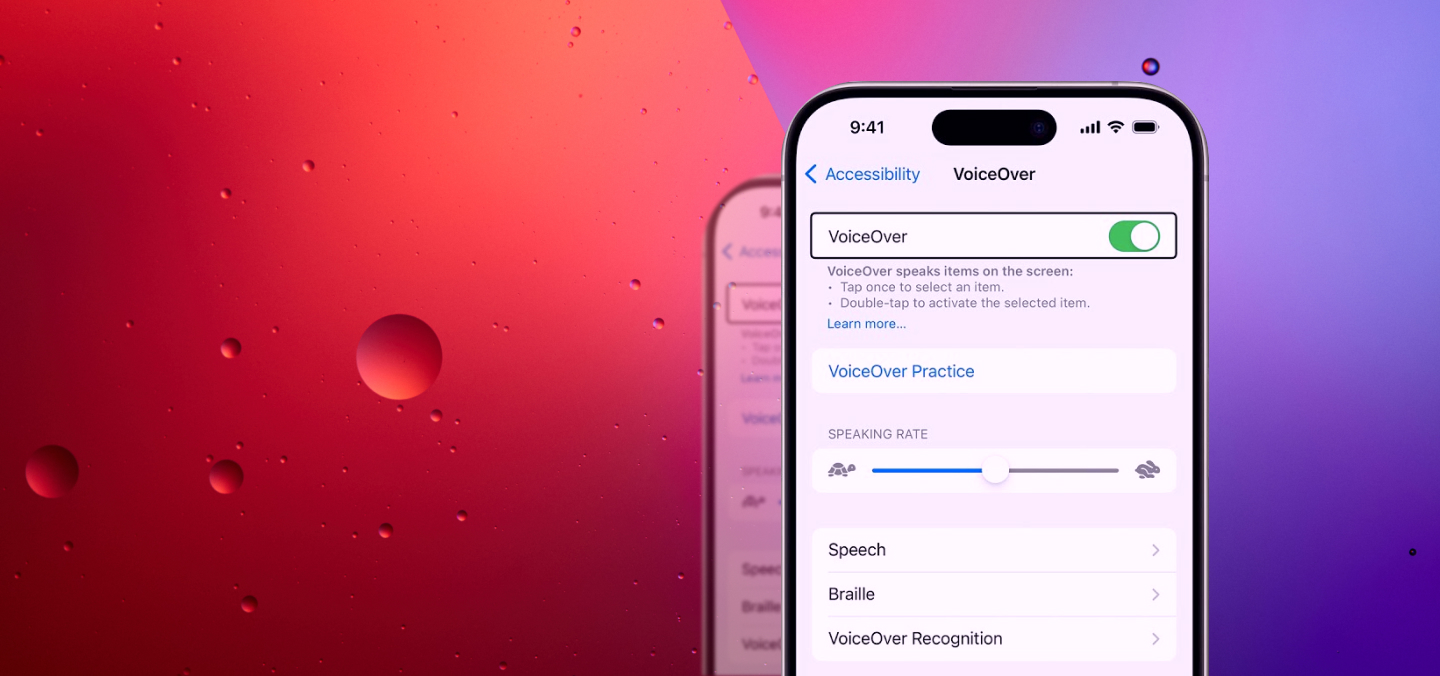
VoiceOver, the iOS screen reader, relies heavily on the developer. The operating system only labels native controls automatically. When custom elements are used, manual context must be provided so that the user can interact correctly.
If these accessibility properties are not provided, VoiceOver may fail to communicate the purpose of the visual element, reading only technical identifiers such as “icon_button_03,” which may confuse the user.
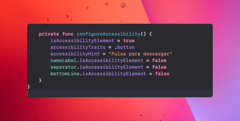
To transform a visual element into an accessible experience, the following properties can be used:
- accessibilityLabel
Function: define what the element is.
Description: should be brief and direct, for example: “Add to cart.”
- accessibilityHint
Function: explains what the element is for.
Description: adds useful context, for example: “Double-tap to save the product.”
- accessibilityValue
Function: indicate the current status or value.
Description: essential in sliders, steppers, or input fields, for example: “50 percent.”
- accessibilityTraits
Function: defines the role of the element.
Description: specifies whether it acts as a button, link, image, header, or other type of control.
- isAccessibilityElement / accessibilityHidden
Function: control visibility.
Description: determines whether an element should be accessible or remain hidden for VoiceOver.
The way VoiceOver navigates the user interface should be logical and predictable. This is controlled by grouping elements and managing focus.
Related elements should be grouped together so that they read as an accessible unit, thereby improving the user experience.
- Grouping views: The key modifier in SwiftUI for this is .accessibilityElement(children:), which defines how views are grouped within a component. When grouping small components (such as an image and a label within a list cell), VoiceOver reads the entire cell’s information at once, rather than reading the individual elements separately.
- Forcing focus: It is possible to force focus on a specific element using mechanisms such as UIAccessibility.post(notification:) or the @AccessibilityFocusState property wrapper. This ensures that the user immediately knows where to direct their attention next.
Other crucial accessibility modifiers
- Reduce Motion/Reduce Transparency: Developers should offer alternatives to complex animations (such as screen transitions) when the user has enabled the “Reduce Motion” preference. The code should check for this setting and reduce visual complexity.
- Tap areas (Hit targets): To improve tactile accessibility, any interactive area (such as a button or link) should have a minimum recommended size (usually 44×44 dots) so that it can be easily touched, even by users with motor difficulties.
Accessibility Inspector
The Accessibility Inspector is an essential tool included in Xcode, designed specifically to test the accessibility experience of an app at runtime, either on a real device or in the simulator.

This tool makes it easier for developers to test and debug accessibility issues in the following ways:
- Real-time VoiceOver inspection: Allows developers to position themselves on any element of the user interface. The inspector displays the accessibility attributes that VoiceOver would read, including accessibilityLabel, accessibilityHint, accessibilityValue, etc.
- Dynamic Type Simulation: The inspector includes sliders that allow you to change the system font size in real time. This allows the developer to immediately see if the vertically growing responsive design works correctly when the text is enlarged.
- Focus tracking: The tool helps visualize the navigation order and grouping of related elements.
Conclusion
Accessibility on iOS requires technical rigor: scalable elements, verified contrasts, correctly labeled controls, and consistent navigation for VoiceOver.
Accessibility is much easier to integrate when it is part of the development process from the outset. If it is integrated naturally into the design, code, and testing, we will avoid problems and extra work later on. It is an ongoing effort, but it makes the product more robust and ready for everyone.