1. What Is Liquid Glass?
2. Liquid Glass in iOS 26: The iPhone’s Major Redesign
2.1 A New Lock Screen
2.2 New Icons and Customization Options
2.3 A Redesigned Control Center
2.4 Liquid Glass Comes to Apps
3. What Happened to Liquid Glass in iOS 27?
3.1 More Control Over Transparency
3.2 Greater Clarity and Legibility
3.3 More Defined Icons
4. Liquid Glass and Third-Party Apps
5. Is Liquid Glass the Future of Apple Design?
6. Liquid Glass Continues to Evolve
7. Sources and References
Apple completely changed the look and feel of its operating systems with the arrival of Liquid Glass in iOS 26. The new visual language represented one of the company’s biggest design overhauls in recent years, introducing transparency, reflections, refractions, and elements capable of dynamically adapting to the content around them.
With the arrival of iOS 27, Apple has not abandoned this direction. On the contrary, the company has used this new version to refine Liquid Glass, improve its legibility, and give users greater control over the intensity of the effect.
But what exactly is Liquid Glass, and what has changed between iOS 26 and iOS 27?
What is Liquid Glass?
Liquid Glass is the new visual material developed by Apple for its operating systems. It was originally introduced in 2025 alongside iOS 26 and was subsequently extended to other Apple platforms.
Unlike simple transparent interfaces, Liquid Glass is designed to react to the content around it. Apple explains that the material combines the optical qualities of glass with real-time rendering, allowing it to reflect and refract elements from its surroundings and change its appearance depending on the context.
The result is an interface with a greater sense of depth and movement, where controls, navigation bars, icons, and other system elements appear to blend with the content displayed behind them.
Liquid Glass is also designed to adapt to Light and Dark Mode, changing its appearance and the colors it displays depending on the context.
Apple took this visual language beyond the iPhone. The design was also introduced to iPadOS, macOS, watchOS, and tvOS, creating a shared aesthetic across much of the company’s ecosystem.
Liquid Glass in iOS 26: The iPhone’s Major Redesign
iOS 26 was the starting point for Liquid Glass. With this update, Apple redesigned numerous elements of the iPhone interface to adopt the new material.
The change was noticeable from the very beginning, from the Lock Screen and Home Screen to Control Center and the system’s built-in applications.
A New Lock Screen
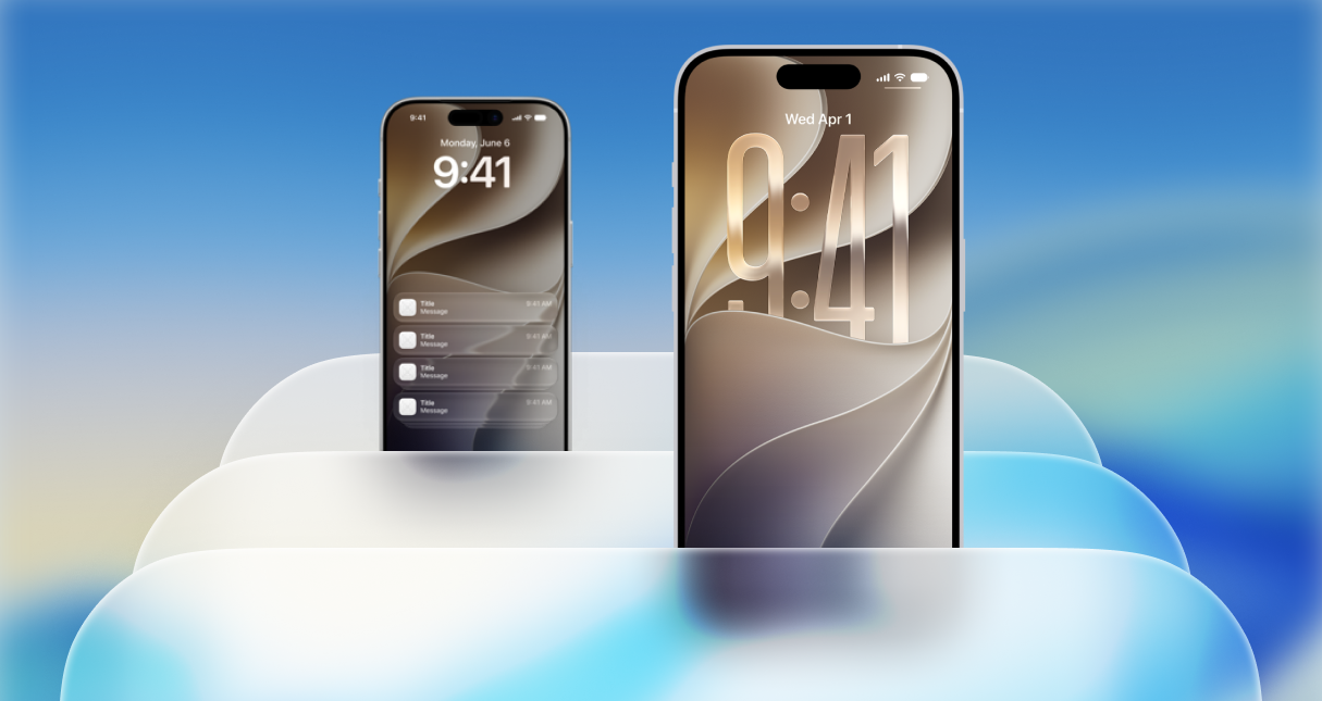
The Lock Screen received elements designed to integrate more naturally with the wallpaper. The clock and other interface components adopted the new visual language, creating a greater sense of depth.
Apple’s goal was for the interface not to compete with the wallpaper, but rather to adapt to it and allow the content to take center stage.
New Icons and Customization
App icons also became part of the visual overhaul.
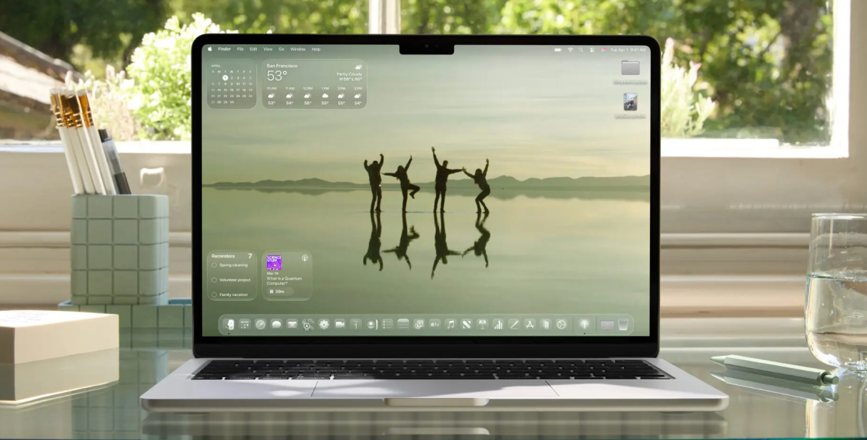
iOS 26 introduced new ways to customize their appearance, including options that allow users to give them a more transparent look that fits the Liquid Glass design language.
This represented a significant change from the traditional appearance of iOS icons, which had previously been much more defined and opaque.
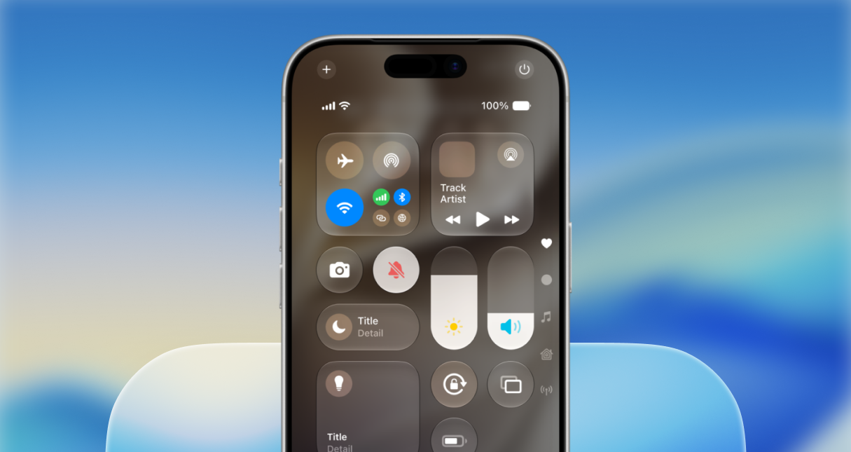
A Redesigned Control Center
Control Center was another area where Liquid Glass became particularly prominent.
The different controls adopted a translucent and dynamic appearance, allowing some of the content behind them to influence their visual presentation.
Buttons, controls, and navigation elements are all part of Apple’s broader strategy to create a more consistent interface.
Liquid Glass Comes to Apps
The change was not limited to system elements.
Apple redesigned different components within its applications to use the new material, including buttons, controls, tab bars, and sidebars.
The company also provided tools that allow developers to incorporate Liquid Glass into their own applications through technologies such as SwiftUI and UIKit.
As a result, Liquid Glass was not presented simply as an aesthetic change to iOS, but as a new design language for the entire Apple ecosystem.
What Happened to Liquid Glass in iOS 27?
With iOS 27, Apple has taken a different approach.
While iOS 26 introduced Liquid Glass as the system’s major visual change, iOS 27 focuses primarily on refining the technology.
Apple describes the experience as more “focused and accessible,” with improvements across different aspects of the design. These include greater customization, changes to icons, and adjustments intended to improve the clarity of interface elements.
More Control Over Transparency
One of the main Liquid Glass updates in iOS 27 is the ability to adjust its intensity.
Apple has introduced a new slider in the system settings that allows users to choose between an Ultra Clear appearance and one that is completely Tinted.
This means users can decide how transparent or opaque they want Liquid Glass to appear.
The option is particularly interesting because it addresses one of the main questions raised by the new design: finding a balance between the visual effect and the ease of reading and identifying different interface elements.
With iOS 27, Liquid Glass is no longer a largely fixed visual experience and offers users greater flexibility in customizing its appearance.
Greater Clarity and Legibility
Apple has also worked on improving the visual experience of Liquid Glass.
The goal of the adjustments introduced in iOS 27 is to create an interface that is clearer and easier to understand, particularly when there is a large amount of content behind translucent elements.
The company has made improvements related to contrast and refraction to ensure that different elements maintain a more defined appearance.
This makes it possible to preserve the distinctive Liquid Glass aesthetic without relying as heavily on transparency to achieve its visual effect.
More Defined Icons
Icons have also received an update in iOS 27.
Apple says that app icons have been updated to provide a sharper and more defined appearance.
The change may seem small compared with the major redesign introduced in iOS 26, but it is part of Apple’s strategy to make Liquid Glass more balanced and consistent throughout the system.
Liquid Glass and Third-Party Apps
One of the most important aspects of the new design is that Apple does not want Liquid Glass to be limited to applications developed by the company itself.
Since the introduction of iOS 26, Apple has provided developers with tools and components to adopt the new visual language.
Frameworks such as SwiftUI make it easier to incorporate Liquid Glass into third-party applications, while the new design guidelines help maintain a consistent experience with the rest of the system.
This means that iOS’s visual transformation can have a progressive effect: as more applications adopt the new design tools, the experience of using different apps will become increasingly consistent.
For developers, therefore, Liquid Glass is not simply an aesthetic consideration. It also means adapting certain application components to Apple’s new design philosophy.
Is Liquid Glass the Future of Apple’s Design?
Everything points to Liquid Glass being more than a one-off change introduced with iOS 26.
Apple presented the new visual language as a cross-platform design system for its major platforms, and one year later, iOS 27 continues in exactly the same direction.
The evolution between the two versions is also significant. Apple has moved from introducing a completely new interface to providing tools that allow users to decide how much they want the effect to stand out.
Rather than abandoning transparency and depth effects, iOS 27 aims to make them more controllable, legible, and adaptable to each person’s preferences.
Liquid Glass Continues to Evolve
Liquid Glass represented one of the most significant visual changes to iOS in recent years.
With iOS 26, Apple introduced a new design language based on transparency, depth, reflections, and refractions that changed the appearance of much of the system.
With iOS 27, the company has chosen to refine that formula. Improvements in legibility, more defined icons, and, particularly, the new control that allows users to adjust Liquid Glass between Ultra Clear and Fully Tinted provide a more customizable experience.
The evolution of Liquid Glass can therefore be summarized in two stages: iOS 26 changed the appearance of iOS; iOS 27 allows users to adjust and refine that new appearance.
The goal remains the same: to create a more dynamic and consistent interface across the Apple ecosystem, while achieving a better balance between design, content, legibility, and personalization.
Sources and references
This article was primarily based on official sources from Apple and Apple Developer.
Images and visual resources: official Apple materials and Apple design resources.
- Apple — iOS 26: nuevo diseño y experiencia del iPhone
Apple Newsroom - Apple — Nuevo diseño de software con Liquid Glass
Apple Newsroom - Apple Developer — Materials: Liquid Glass
Apple Human Interface Guidelines - Apple Design Resources — Kits de diseño para iOS y iPadOS
Apple Design Resources - Apple — Herramientas y tecnologías para desarrolladores
Apple Newsroom - Apple Developer — Novedades de diseño
Apple Developer